Firstly, our new homepage — simpler, less flashy, and with an interactive playground in the hero. So visitors can get a feel of how BaseHub works without even logging in.
Secondly, we're open sourcing our AI Week Template, so you can use it in your next launch week! It's a beautiful little site, simple and neat, with a couple of details that make it shine:
You can now create multiple AI agents in BaseHub—each with their own custom system prompt, tool access, and permissions. Whether you need a documentation bot for your users, a marketing assistant for consistent brand voice, or a research agent with read-only access, you're in full control.
Key capabilities:
Create agents from scratch with unique names and purposes
Fine-tune system prompts to match exact voice, tone, or behavior
Control tool access (web search, file editing, workflow triggers)
Set specific permission levels (read-only, full access, or custom combinations)
Customize visual appearance with avatars and colors for external use
Your existing START agent now becomes fully customizable. Modify its system prompt and adjust tool permissions while maintaining full BaseHub integration.
All BaseHub users can access the new Agents tab to create and customize AI agents. Custom Agents are currently available in free beta with full access to all features.
For detailed setup guides, integration examples, and step-by-step instructions, check out our Agents documentation.
We can't wait to see the specialized agents you'll create and how they'll transform your content operations.
Automatically populate related content blocks when specific fields change. For instance, update a product description and let AI Autofill generate meta descriptions, social media captions, or related items—while staying true to your voice.
@START is an AI assistant that deeply understands your BaseHub repository structure. Unlike generic AI tools, START can analyze your schema, content relationships, and block configurations to provide contextually relevant suggestions and make intelligent content changes.
With START, you can:
Get content suggestions based on your existing repository structure
Receive schema recommendations tailored to your specific content needs
Generate content that maintains consistency with your existing style and structure
You can interact with START in two main ways: through the launcher or by tagging it in comments.
Image and file understanding capabilities are currently in development! With this, START will be a good fit for running content migrations, or creating schemas based on UI screenshots. Stay tuned!
START is available now to all BaseHub users, and is free during our Beta period. You can expect a tokens-based pricing scheme, and a model selector to balance cost/performance.
v9 doesn’t introduce too many new features nor breaking changes, but it does fundamentally change how types are generated. Critically, the basehub SDK can now work without a “generation step”, and the generation step now only augments the SDK with type information.
This seems subtle, but fixes many bugs related to basehub not being able to resolve. For context, before v9, running basehub dev or basehub build was required for the runtime to get its graphql client. The generation step created the SDK, plus the types. Now, the client is “static” in the sense that’s ready to use once installed, and the generation step is just there for optional typesafety. Additionally, this typesafety works with TypeScript’s declaration merging, which means no more “Restart TS server” to make types work again.
While this version might seem subtle, it allows the library to run in environments that don’t have a build step (or acess to Node.js for a CLI to run). Environments like v0 or Bolt.
BaseHub can now run flawlessly in v0, which means… templates are coming.
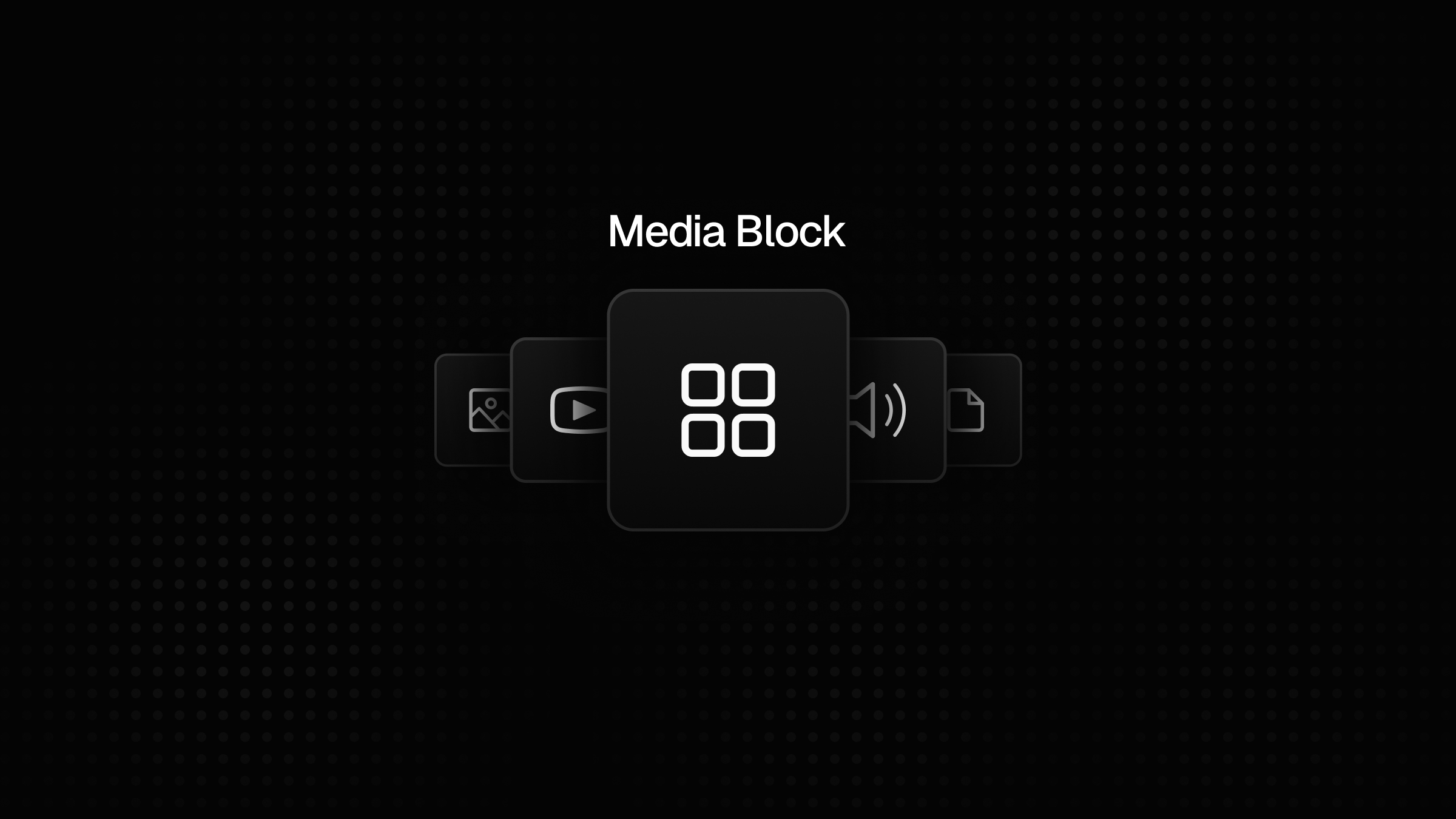
We merged media blocks into one more powerful and flexible block that comes up with an asset explorer.
We received plenty of feedback asking for a unified way to handle media assets. We listened, and we're excited to introduce our new Media Block that consolidates images, videos, audio, and files into a single, powerful solution.
The new Media Block replaces our previous separate Image, Video, Audio, and File blocks with a single, more powerful solution. When you add a Media Block, you can limit which file formats are allowed, similarly to how it worked with the previous blocks, except that now it discriminates formats by categories (image, video, audio and file).
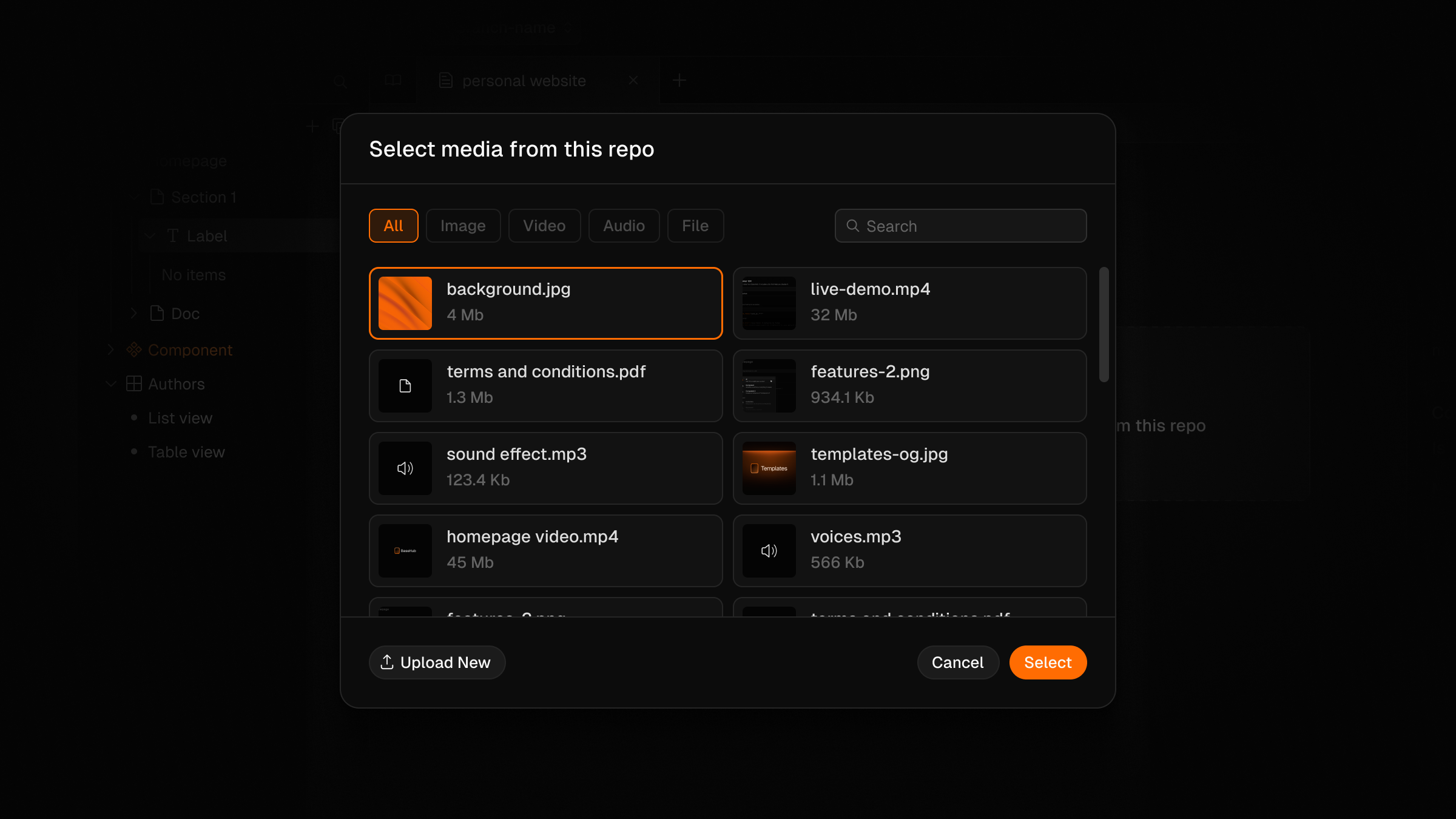
Asset Explorer
The Asset Explorer gives you a gallery view of all media in your repository, including filters and a search input, making it easy to find and reuse existing assets.
Out of the box, the Media Block supports common formats like images (JPG, PNG, GIF, WebP, SVG), videos (MP4, WebM), audio files (MP3, WAV, OGG), and documents (PDF, DOCX, etc.). But the real power comes from the ability to add custom MIME types to support virtually any media format your project requires.
You can also check out the updated documentation to learn how to query the new MediaBlock Union via GraphQL. Try out the new Media Block and let us know what you think!
Seamlessly browse, compare, and restore previous versions with our enhanced history navigation
The History panel is where you see your commit history in BaseHub. We've completely revamped it to give you more control and visibility into how your content has evolved over time.
Previously, the History panel was a simple chronological list of commits. Now, you can filter commits based on who made them and when they were created.
Filter through commits by date range, or by author.
Looking for changes made by a specific team member? Just select their name from the author filter. Need to find commits from last week? Use the date range picker to narrow down your search. This makes it much easier to find exactly what you're looking for, especially in repositories with extensive commit histories.
One of the most powerful new features is the ability to navigate your repository at any point in time. Select any commit from your history, and you'll see exactly how your repository looked at that moment.
This is incredibly useful for:
Understanding how your content has evolved
Reviewing changes before making further edits
Training new team members on your content structure
Troubleshooting issues by comparing different versions
Found an older version of a block that you prefer? Now you can easily restore it. When viewing a historical version of your repository, you can select any block and restore it to that previous state.
Click "Recover" and you're good to go.
This means no more digging through commit histories trying to manually recreate previous content. With just a few clicks, you can bring back exactly what you need.
We hear you, we revisited the Variants set workflow and improved the overall experience when setting variants through the dashboard.
Setting variants for layout blocks and each of its descendants manually was counter-intuitive and a bit annoying to be honest. But we didn’t want to loose the possibility of carefully chose which blocks should be affected by variants and which will only have a global value. So we join all configs together in an improved popover where you can set up all document’s children easily with a few clicks.
Track your blocks' history, contributions and partially commit your content safely with our improved version control.
Commits are fundamental to BaseHub's workflow, supporting publications, repository changes, and branching. However, tracking individual block changes has been challenging. Block Milestones address this by providing detailed change tracking across commits, branches, and work in progress (WIP).
The new "History" tab in block properties offers a comprehensive view of block changes. Users can filter changes by date ranges and authors for precise historical insights.
The History tab, in the right-hand side of each block's panel.
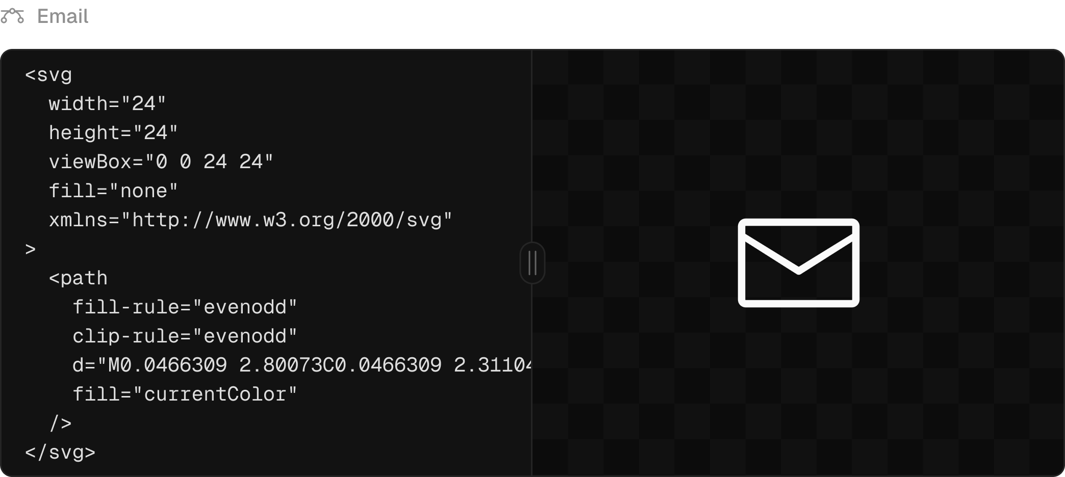
Skip the SVG uploads—render icons from BaseHub blocks directly as React components.
Until now, the only method to host icons or logos in BaseHub has been through image blocks and <img /> elements in your application. This approach presents several limitations:
The inability to customize icon colors makes the solution impractical for scenarios requiring dynamic color schemes, such as dark/light theme switching.
SVG animations cannot be implemented due to the absence of rendered paths, rects, and other vector elements.
The editing workflow in the BaseHub dashboard is awkward, requiring multiple steps (downloading SVGs, optimizing them, and uploading them to BaseHub).
Preview functionality is limited, particularly when detailed inspection through zooming is needed.
The new icon block simplifies the process of working with vectors in BaseHub. It enables seamless rendering of SVG elements in the DOM, offering a more efficient approach compared to traditional image blocks and <img> tags.
Implement this feature using the new Icon component from our SDK.
pnpm add basehub@latest
Here's an example demonstrating how to render this block in your React application:
The components prop enables customization of rendered elements within an SVG. This feature is particularly useful for implementing dynamic styling or animating inner paths, for example.
Inspired by our previous Analytics offering, we're introducing a more powerful “Event” Block. It comes with two layouts that adapt to your needs: a table layout for complex data structures and a time-series layout.
The table layout excels at showcasing detailed event information with customizable columns and filtering options. The time-series layout enables trend analysis across different time ranges, perfect for metrics and reporting.
For developers, we've rebuilt the event functions from the ground up. The new sendEvent, updateEvent, and getEvents are fully type-safe and work seamlessly with the Event Block’s schema.
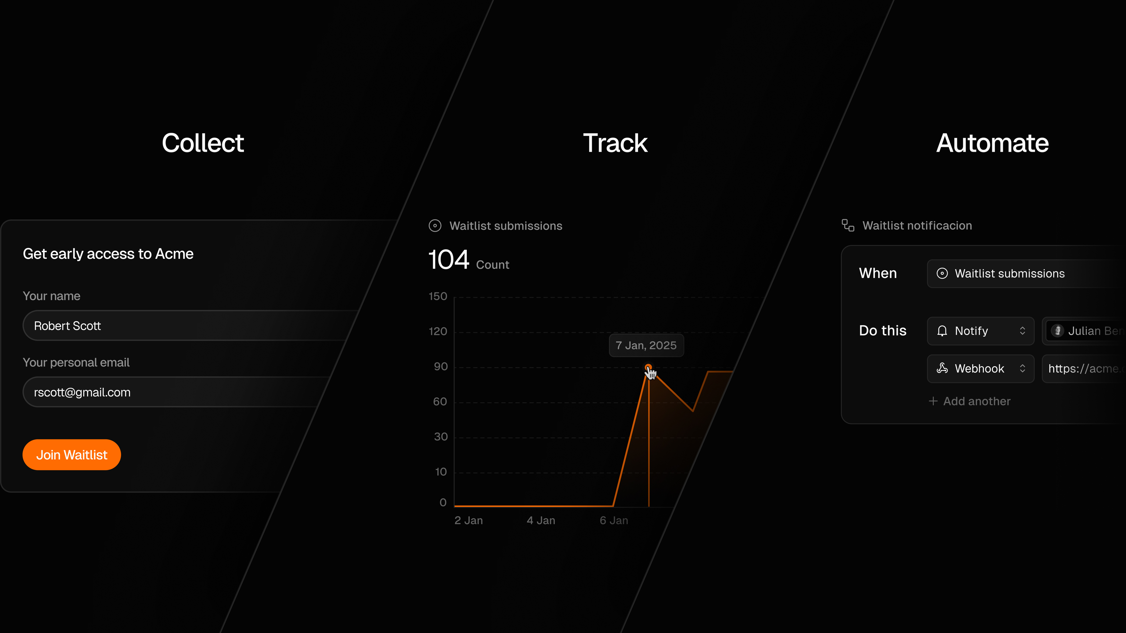
Collecting and reviewing data is nice, but what can we do with all this data? This is a question we asked ourselves while designing the Event Block, and that’s why we built the Workflow Block. The workflow block, as its name implies, is designed to automate different actions inside your repo. V1 launches with essential triggers:
New commits,
Collection updates (row create/update/delete), and
Event submissions.
When any of these happen, you can send a webhook to a server you own, or an internal notification. Each combination of trigger + action opens up new automation possibilities: from simple “contact us” forms, to fully functional newsletter subscriptions, workflows will help you enhance your repository's capabilities.
This first demo goes over everything needed to start working with Forms in BaseHub. It covers: creating the Event Block, hooking it up with the Next.js App, as well as listening for new submissions and posting them to a Discord Channel via a Workflow Block.
With this release, we hope to have conveyed our commitment to creating powerful primitives that, when paired together, can enable more functionality than they seem to on their own. See you in the next one!
Undo/redo will give you more confidence to experiment, knowing that you can safely go right back.
Our editor now has undo/redo! This means that, if you make a silly mistake, like deleting a component you didn’t intend to delete, you can now undo the operation and keep going.
Some curious features of our implementation
The undo/redo stack is serializable, which means it’ll resist page refreshes. The state is stored in sessionStorage.
The undo/redo stack is repo wide, which means as you move through different places in the dashboard, you’ll be able to undo/redo operations you did anywhere.
This was quite challenging to implement. Our data model is highly dynamic, as it allows different block types, relationships, constraints, etc… and different ways you can edit these: the slash command, pressing “Enter” to create a new block, editing constraints via the properties panel, the context menu, etc.
Concretely, there were three main challenges we had to figure out to make this a successful project:
Block dependencies: Blocks such as the Reference Block can target other blocks, such as Instance Blocks. Now, when an Instance Block gets deleted, it also gets removed from Reference Blocks that are targeting it—we call this a “side effect”. When the user undoes the original operation, all side effects should be undone as well. There are more side effects like this one, and we needed to handle these correctly.
Tabs, and focus states: Because you can take action against a Block from different places—for example, you could edit the title via the properties panel or via the editor—when you undo an operation, we need to take you back to where the operation was performed before undoing it, to prevent confusion.
Make it play nicely with yjs’ Undo Manager: Our Rich Text Block uses yjs to enable collaboration. Yjs has an internal Undo Manager which wasn’t easy to replace. In fact, we decided not to replace it, but rather, include it in our global undo manager in a clever way.
With these three things sorted out, it was downhill from there.
Three quality-of-life updates to keep improving the editing experience.
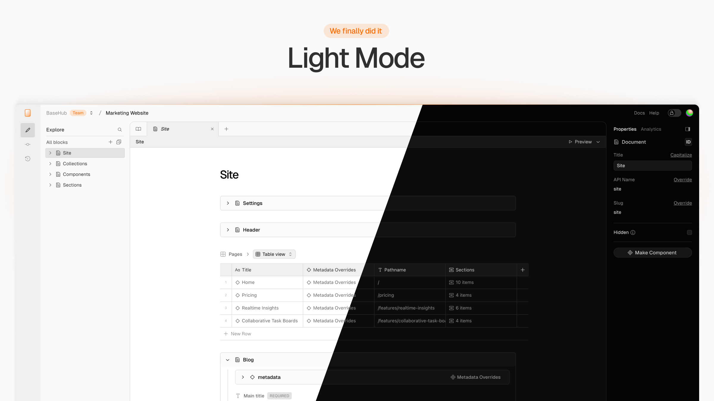
Light mode is now available in BaseHub. You can update your preferred color scheme in the user dropdown (top right), picking between System, Light, or Dark.
We finally did it! You'll see much better in bright environments.
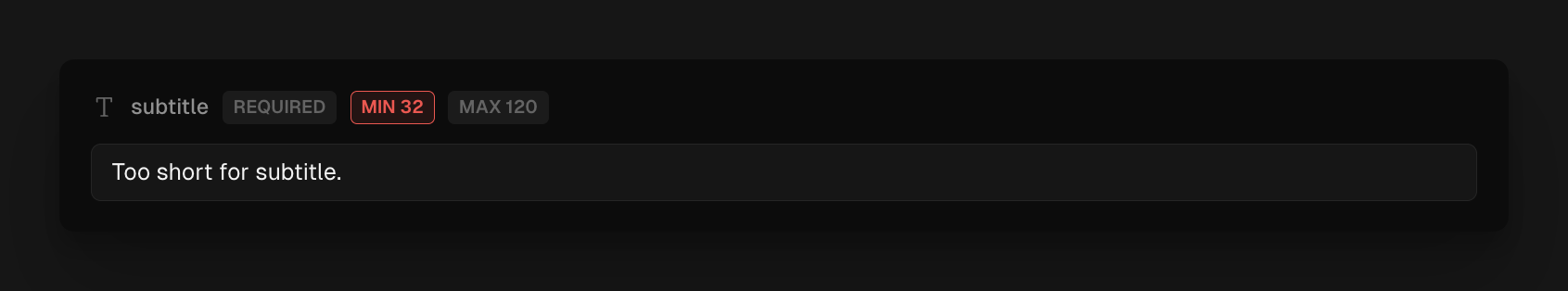
Field constraints are now visible directly in the editor. You can see specific requirements for each field while editing, such as character limits, field required or other applied constraints. This leads to smoother content creation with no surprises when you try to commit your changes.
Streamline your workflow: effortlessly copy and paste across teams and repos within BaseHub.
Oftentimes, developers build the same schemas over and over again: blogs, documentation, programmatic pages, etc. This will make their lives easier. You can now copy any block from any repository and paste it wherever you want.
When pasting complex structures, you might encounter a document named “Support Blocks Wrapper” next to your copied block, this document contains all necessary data for the block to work. It usually contains components that are referenced or template components in use.
It contains common structures that we often use to build with BaseHub. Apart from that, we added some more complex structures that can inspire you to build more custom solutions, these includes a multi-language blog, programmatic pages and more.
Working on a localized website? “Variants” are being developed right now, so you might want to wait before taking an example from the Kitchen Sink. If it serves as inspiration, then great!
This update makes the collection block much more powerful.
We’ve just revamped our Collection Block, introducing new functionalities designed to improve its editing experience, presentation and user experience.
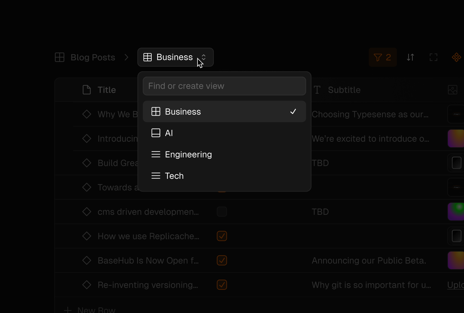
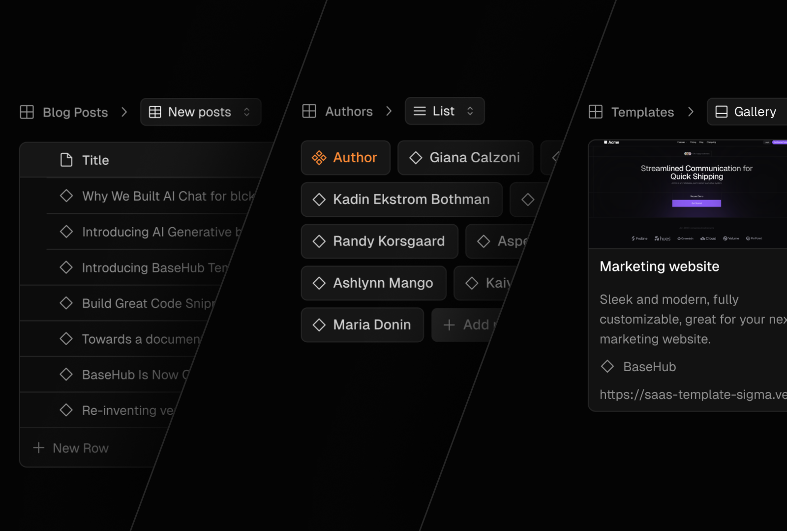
You can now create and manage various presentations of the same dataset within a single Collection Block. This enables tailoring the display of content to different contexts or audiences without duplicating data.
A single collection can now have as many views as desired, each offering a singular perspective on its content.
Navigate through views or create new ones using the switcher
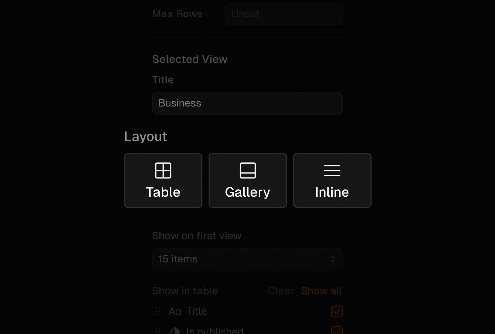
We have introduced three distinct layout options to cater to different content presentation needs.
You can switch between them in your collection’s block properties panel.
Table: Provides a structured format ideal for comparative data, displaying information in rows and columns.
Built on top of Glide Data Grid (shoutout to this great library for helping us get this feature out quickly).
Gallery: Optimized for visual content. Displays collection items as cards, featuring a thumbnail (image or video) alongside the rest of its content. This layout is ideal for showcasing entries with eye-catching previews.
Inline: Offers a concise, space-efficient layout that displays items side-by-side with key text information, suitable for compact lists or quick overviews.
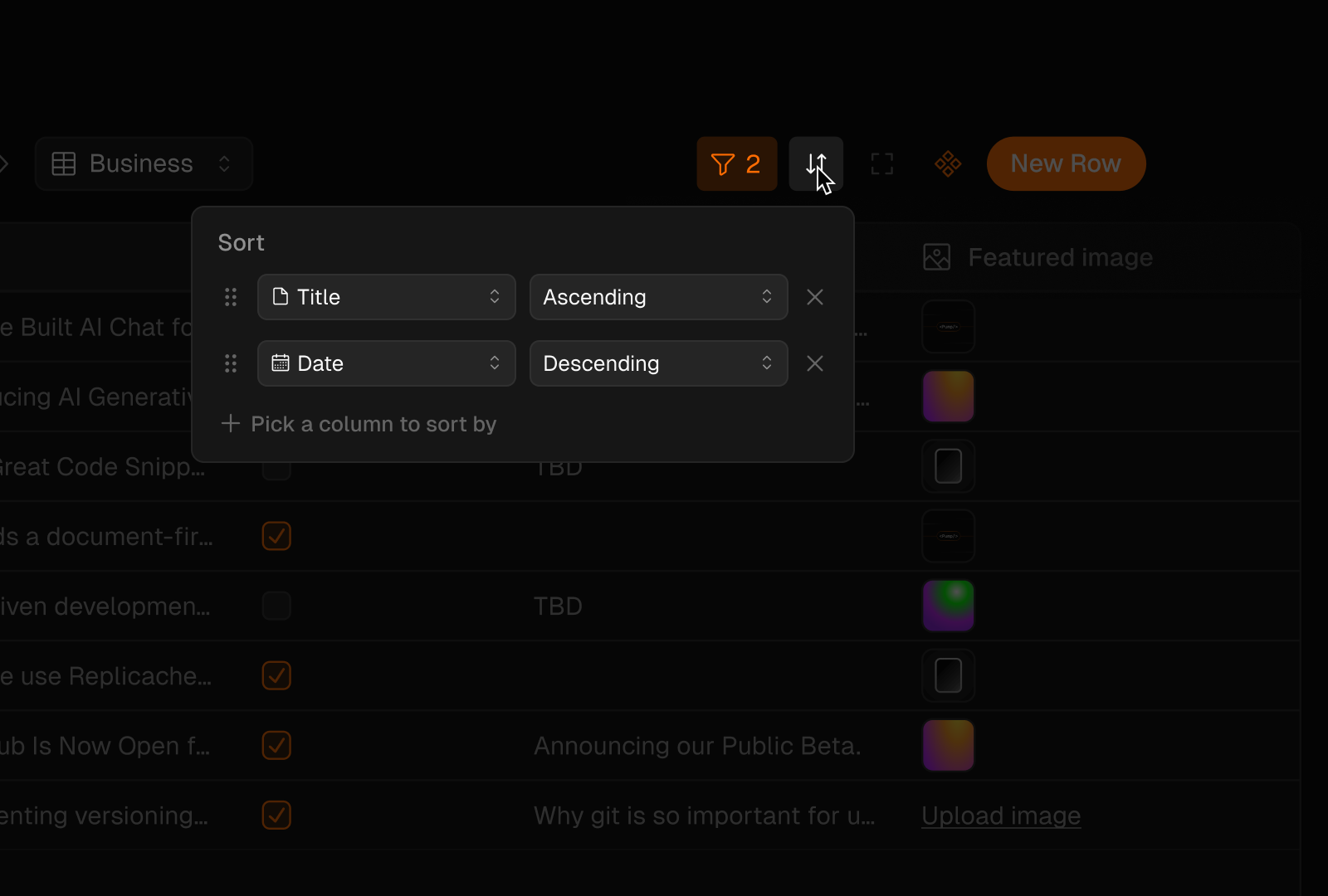
Sorting and filtering capabilities were added as a way to organize data within each view. Users can now customize how information is arranged and displayed, tailoring it to specific needs or preferences. Here's what you can do:
Sorting: Arrange items based on any field in ascending or descending order.
Filtering: Create custom filters to show only the data that meets specific criteria. This allows you to focus on relevant information and hide the rest.
View-specific settings: Each view can have its own unique combination of sorting and filtering rules. This means you can create multiple perspectives on the same data set without altering the underlying information.
The Table View layout allows for inline editing of most fields directly in the table, eliminating the need to open separate documents for individual rows. This enhances speed, particularly when making frequent updates by providing a more seamless editing experience.
You can now drag & drop assets into your collection while using the Table View. This allows you to quickly create and upload files for multiple entries all at once, reducing the time and effort required for data entry. Bulk uploads is especially useful for initial setups or periodic updates where multiple entries need to be added simultaneously.
Commit messages are essential for tracking changes and understanding the history of your Repository.
However, we recognize that content editors often find it cumbersome to create concise yet descriptive commit messages during the thick of writing a piece. AI Commit Suggestions steps in by offering simple messages that summarize your changes.
This feature is in Alpha. If you have any feedback, feel free to reach out via X or Discord.
We recognized the need for a more immersive collaboration experience, so we implemented live cursors and activity tracking in your editor.
Since last week you can already work with others more seamlessly in the BaseHub editor, knowing with more precision what each member is doing, and with the possibility of following them, specially useful while having a peer working session.
To follow someone working in the current repo simply click on its avatar on the top right and a pill with the following status will appear at the bottom. To stop following you can click again their avatar, click the stop button or rather navigate to a different tab in the dashboard.
There are actually a bunch of options to use. We use Cloudflare to handle this, and you can check their docs to see all of the options you have available.
import BaseHubImage from "basehub/next-image"const Home = async () => { return ( <BaseHubImage src="https://assets.basehub.com/2fa958b2/mBV9NVWPK632ZKmv9lffA/image.png" width={846} height={564} /> )}export default Home
We built this because most developers don’t want to query our GraphQL API to get images in different sizes and formats and whatnot: they want their framework to do that work. So, <BaseHubImage /> is the same as Next.js’ but uses BaseHub’s Image Pipeline directly instead of using Next.js as the middleman.
Although this is not something you should worry much about, if you plan on having many, many images, Next.js’ own image optimization might get resource intensive—and we’re already doing that optimization for you.
ThumbHash, created by Evan Wallace, is a library for creating “a very compact representation of an image placeholder”. Well, you can now get a thumbhash for every image you upload into BaseHub.
Keep in mind, in order to render the thumbhash in the browser, you’ll need to decode it using the thumbhash package, or a library like unlazy.
To save you from the hassle of decoding the thumbhash, you can also get the blurDataURL directly from our GraphQL API, which will be ready for use as an <img>’s src.
When to use one vs the other? thumbhash is more lightweight (~30 bytes) than blurDataURL (~400 bytes), so if you want to save some KB (say you’re loading hundreds of images), then you might prefer to use thumbhash. Else, you’ll probably be better off with blurDataURL.
Moreover, when using thumbhash, you’ll need to decode the string yourself in the client side, which might not be what you want. Typical use cases for using the raw thumbhash are when rendering hundreds of images in the same view, such as on an image gallery.
Putting it all together, your list of blog posts can render like this:
We truly believe developers will get a big head start when starting with one of these, and they’ll also be able to extend and adapt them to their own needs.
We introduced a lightweight analytics feature right next to your BaseHub blocks. It's easy to set up: simply obtain the _analyticsKey from the block where you want to store the events, pass it along with the custom event name to the sendEvent SDK function, and that's it! The triggered events will then be automatically displayed in the Analytics tab adjacent to your content. Read more in our docs.
The events are listed based on the last one updated. You can filter them out or select a different time range. Every event showcases its total count alongside a historical graph. If you hover any point on the graphs, you will start to see the data belonging to that timestamp in particular.
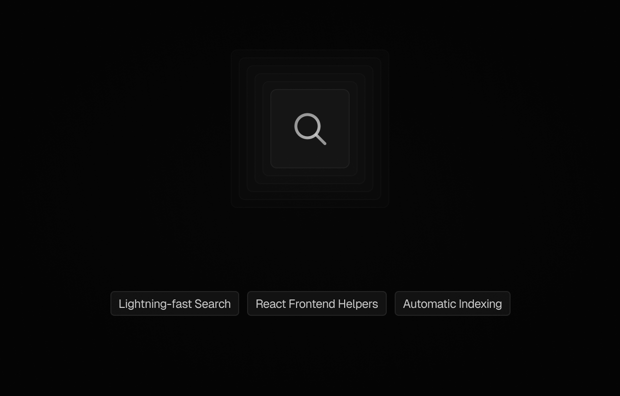
Index your content with one click, setup the Search components from our SDK, commit and see the search results appear on your screen.
Working on the new BaseHub templates, we found out we needed to setup search for our documentation. We have already skipped that setup for our last docs version because of the time that it takes to integrate a third-party service for search. We didn’t want to pass through that again. So we decided to provide a search engine from BaseHub.
This engine features automatic indexing and a handful of React components for easy setup. It can be scoped to an entire repository or just one collection of articles. You decide which blocks become exposed to the search client. Read our docs to learn how to set it up in your app.
We provide a few components that help you leverage the frontend functionality for your site search. And the best part: it comes with keyboard navigation and match highlighting out-of-the-box! You can check out all Search components in the API Reference.
Special shoutout to TypeSense, without which this integration wouldn’t have been possible.
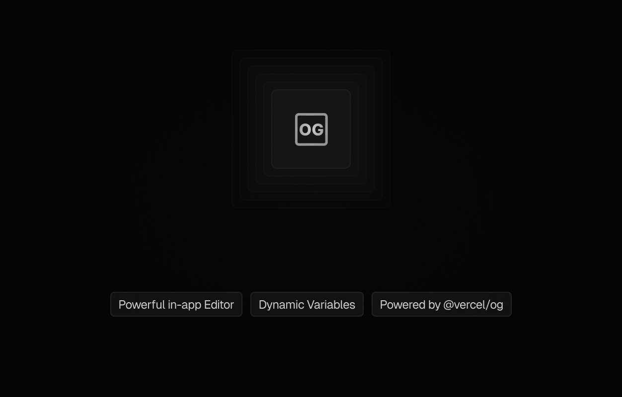
The OG Image block introduces a powerful in-app, yet lightweight, editor that lets you create your own social cards based on your content.
A special block for creating your custom OG images, based on layers and variables that come from your blocks content.
A common use case is setting the OG for your blog articles for example. You design the image once, and then BaseHub automatically populates the variables based on the specific content in each article.
When Santiago Galán, a BaseHub user, showed us the product he was working on we instantly knew this was a game changer for OG Image editing. SharePreviews is an amazing open-source OG Image editor. We wanted that inside BaseHub, as BaseHub is already the place where content lives. If we could pair dynamic BaseHub content with the OG Image editor, we’d be golden.
So that’s exactly what we did. We collaborate closely with Santiago to build and ship the new OG Image editor within BaseHub. This now powers OG Images throughout our docs and our help center, and we can’t wait to see the beautiful images you’ll create.
Until now, making fragments with the BaseHub SDK was cumbersome. It required managing multiple generated types for each component and using satisfies for type enforcement from the schema into an object.
However, with the introduction of the new fragmentOn function, generating fragments is now effortless, without needing to know the import name, just start typing the Component’s apiName and the autocomplete takes care of the rest. In the second parameter you can set the fragment object safely typed.
// all the imports you need!import { fragmentOn } from "basehub"const CalloutFragment = fragmentOn("CalloutComponent", { _title: true, _id: true, type: true, content: { html: true, },})export type Callout = fragmentOn.infer<typeof CalloutFragment>
Type safety is a core tenant of our DX. Until today, Select Blocks were typed as a regular string, which meant developers couldn’t actually know what they’d receive. Because Select Blocks are constrained to specific values in the BaseHub dash, one would expect to receive a union of string literals back… So that’s exactly what you’ll get now.
If you constrain a Select Block to “primary“ or “secondary” in the BaseHub dash, you’ll get “primary“ | “secondary” in your IDE.
Enable this feature to restrict editing capabilities, safeguarding your project's schema while allowing content modifications.
Edit mode is based on the restrictions to the Editor role we introduced some time ago – you can read more about it on this changelog. This mode ensures you can update content without the risk of altering the underlying schema. Features such as constraints application, block removal, and reordering are disabled, allowing you to concentrate exclusively on content refinement.
Note: “mark” refers to formatting that’s applied on characters, such as making something bold, or italic, or having inline code.
One of the most frustrating parts of WYSIWYG editors is the way marks work. Let’s say you have something marked as bold. Then, to go back and add something right before it, you’ll need to struggle with your editor sometimes adding the text inside of the mark (marking it as bold), or vice versa. This is how it works in Slack:
The whole thing is unpredictable and hard to explain, but we’ve all experienced it.
We had this same issue in our own Rich Text editor, and we simply couldn’t live with it. This is how you edit marks now:
Before this update, editors could apply any type of formatting to Rich Text Blocks. Headings, lists, images, videos, etc… were all available, always.
We heard from developers that sometimes it’s very useful to limit which formatting can be applied, so the rendering stays consistent. For example, you may want to limit blog posts’ contents to not support H1, and only support H2 and H3. Or you may not want to support tables, or videos. You get the idea!
Now, you can do so within the Rich Text’s properties panel.
The new editor layout sets the foundational stone for new screens and features. Let's see what it bring as of today.
The new README works as an initial screen to quickly see and edit useful info about the repository. You might noticed the old “Connect” page is embedded here now. We also have the possibility to edit the repository’s title and description, all in one place. The README is a special tab that functions as empty-state, wiki and quick kick off of the project simultaneously.
The new sidebar navigation involves some renaming of sections:
Explore
Previously “Content”, where your work in progress leaves, here you can access all your repo blocks and edit them.
Changes
Previously “Commit”, where you can see the diff between your WIP and the last commit tree.
History
Previously “Commits”, where you can access the full list of past commits since the beginning of the repo.
Tabs are now persisted between Explore, Changes, and History, which means you can have an open tab for a piece you’re editing, a tab showing the diff, and also a tab showing a previous commit, all in the same context.
Overall, this redesign gives us a lot more space for adding new features without cluttering the UI. The header is now cleaner and well suited for our upcoming Branching selector, and the left sidebar has a lot of space for new panels.
In addition to the already known "Owner" and "Member" roles, we've introduced new role types aimed at addressing previously overlooked use cases. These four roles prioritize simplicity and ease of use in both UI design and tool functionality for every scenario. After all, why burden someone who simply needs to change copy with a needlessly complex user interface? It's important to ensure that editors and non-technical individuals don't alter the schema.
Owner
Has access to everything inside this repo. Can invite, grant or remove roles. Can edit, create, remove blocks and their properties. Anything that can be done in BaseHub, the Owner has the permissions to do it.
Member
Can edit, create, remove blocks and their properties. Can create and delete repositories. The highest role apart from the Owner, is the most versatile, without incurring in team management nor billing settings.
Editor
Can edit blocks and content; can add new collection instances. Think of it as a copywriter / marketer, they can add a post entry, or update a subtitle, or change an image, but they won’t be able to delete documents, or create new blocks that would change the API schema.
Viewer
Can view all the content, including hidden values and members settings. This is a less crucial role, but think of it as a guest that could check everything looks good, without needing to worry about modifying anything by accident.
Introducing <Pump />, and our newly revamped Preview Workflow.
Pump is a React Server Component that enables a Fast Refresh-like experience for your content. When draft === true, Pump will subscribe to changes in real time from your Repo, and so keep your UI up-to-date. This is ideal for previewing content before pushing it to production. When draft === false, Pump will hit the Query API directly, without any production impact whatsoever. You can use it like this:
Additionally, we’ve revamped our Preview Workflow, adding a new “Preview” configuration and button. This will help developers configure Preview URLs for content editors to check out their content before publishing.
Read more about the new Preview Workflow in our docs.
We’ve revamped code blocks inside the rich text editor to include syntax highlighting for common languages. We’ve also worked on a quality-of-life improvement: code formatting. We know that writing a code example for your website can be tedious, so we hope these two improvements make your life easier.
Interact with your editor faster by using your keyboard.
In addition to the existing keyboard shortcuts, we have introduced several new keyboard navigation features to further enhance your experience while writing content. These features allow you to quickly and efficiently perform actions on your blocks without the need for a mouse.
You can now use the arrow keys, specifically the up and down arrows, to effortlessly navigate through your documents. This makes it easier to move between different sections or documents without having to manually scroll.
To toggle block focus, simply press Enter or Escape. This allows you to easily switch between blocks and focus on the specific one you want to edit or modify.
Deleting a block has never been easier with the introduction of the Cmd + Del shortcut. This allows you to quickly remove a block from your document without the need for multiple clicks or menu options.
To copy a block, press Cmd + C, and to paste it somewhere else, use Cmd + V. This makes it effortless to duplicate content or move it to a different section within your document.
Lastly, you can also cut a block by using the Cmd + X shortcut. This removes the block from its current position and allows you to paste it elsewhere, providing a seamless editing experience.
Copy-paste in between two repos is not currently supported, but in the roadmap!
With these improved keyboard navigation features, we aim to make the process of writing and editing content even more efficient and user-friendly.
We've added webhooks to BaseHub, starting with the Commit event. We're planning on adding more events soon.
Webhooks allow you to receive event notifications from BaseHub. BaseHub will send a POST request to a URL you specify when certain events happen in a BaseHub Repository.
BaseHub processes webhooks with Svix. The Svix integration was easy-peasy to set up, yet another example of great DX.
The only supported webhook right now is repo.commit. This is a useful notification that can help you set up on-demand revalidation for your Next.js Apps, amongst other things. Another common use case is search indexing: imagine you want to set up an Algolia integration, where you get content from BaseHub and index it into Algolia—at commit time is a great time to do so.
On the roadmap: We’re working on automatically indexing your content, thus supporting Search functionality via our API out-of-the-box. Stay tuned!
We’re working on adding more events into the mix, so stay tuned.
After a long and useful Alpha Phase, we’re now entering Beta. BaseHub is now reliable enough to support production workloads, although, as we move through our Beta, we’ll be monitoring how our infrastructure scales, we’ll work thorough potential bugs that may arise, and we’ll make progress on our roadmap. We’ll work hard towards General Availability.
As part of our Public Beta Launch, we're releasing the Diff View, our official Docs, and our Pricing Plans. Let’s go over these announcements.
We shipped our Docs, one place in which you can get to know the Platform. We'll work hard to explain concepts in a simple manner, and add guides and examples for you to connect BaseHub to popular web frameworks. You can check out our guide for connecting to Next.js to get a hang of how our DX is!
We've built the Billing infrastructure that will let us provide the service sustainably. Now Teams can pay for BaseHub, and our pricing plans are as it follows:
Personal Account, starts completely for free, and includes:
We’re beyond greatful for our Alpha Users. They provided us with valuable feedback and bug reports, and they’ve seen how we’re constantly improving BaseHub, one day at a time. Because of that, Alpha Users will be able to use BaseHub completely for free until 23 May, 2024. If you’re an Alpha User and you’re worried about this date or our pricing, don’t hesitate to reach out.
If you’ve made edits by mistake, you can now "discard all changes" to revert the working state back to the state it was at the latest commit.
Additionally, we’re working hard on building a brand new Diff UI that will help you see exactly the changes you’re about to commit. These are important steps that align with our vision for Open Content. Diffing, reverting, branching… are all on our radar. Stay tuned!
Often times, we’ll find ourselves wanting to render a Tweet in the body of our blog posts, or a callout, or any other thing specific to our website’s content needs that isn’t strictly formatting. Well, with this addition, now we can! Let’s see how.
To get started, we need to configure our rich text block to support a component. In this example, we'll create a Tweet component and configure it to be instantiated within the body of our blog posts.
Once we've created our Tweet component, we’ll select our rich text block and check “Tweet” in the “Allowed component types“ constraint. This will expose it in our rich text’s slash command.
Now, we can do /tweet to add a Tweet right in the body of our post. Additionally, we can use a custom component to “mark” a piece of text (like we do so when we make it bold or italic), available via the bubble menu. This is useful for adding custom popovers or tooltips to specific pieces of text.
To render our custom components, we'll use <RichText />. We’ll install basehub via NPM, and import { RichText } from 'basehub/react'. This component is designed to facilitate the rendering of rich text data. It's straightforward to use and works well with TypeScript.
This is a small example of how we’ll use it alongside the amazing react-tweet to render static tweets:
The body of the component fetches the data with basehub, and the return uses <RichText /> to render the data. Via components, we pass our custom renderers. It’s important to send through the blocks prop so that <RichText /> can match the references to the custom blocks.
This is just a quick overview of what you can do with custom blocks inside rich text. Expect more examples soon, as we ramp up our marketing and documentation efforts.
Oh, and by the way, we hope you enjoy our new Changelog!
A deeper dive on how we've solved "work in progress" in BaseHub.
A great feature of BaseHub is that stuff gets committed all at once, creating a snapshot of your repository at that point in time. We haven’t yet seen released the full implications of that git-like workflow, but it will allow you to:
See everything you’re about to commit, and choose what goes in or what gets restored to its previous state.
See past changes across your whole repository, or across a single document, and revert if you made a mistake.
Create branches to work on new stuff without affecting production.
And a lot more.
Now, one inconvenience that “committing everything together“ brought, was that you would struggle to create “work in progress” content, cause you were obliged to commit it, and therefore expose it to the API. Not only that: if you are rigorous with your constraints (which you should), you’d get a bunch of “is required” errors when attempting to commit, and you’d be forced to either lower the constraints, or enter in dummy data.
That’s why we created the “hidden” state. A hidden block will not be exposed via API, and will skip commit validation. You can hide a block via the properties panel, or via the sidebar. You can only hide documents, components, and instances; and nested components/instances inherit hidden state from its parent for convenience.
This is not the same as the “draft/published” workflow that other systems offer. Our “hidden“ state is something that needs to be committed, meaning, everything that gets committed passes the validation you’ve set up, always. The fact that, in other systems, publishing is controlled per-entry makes it easy for users to enter an incorrect state. If you’ve started with loose constraints and at some point decided to tighten them up, then you may have fields that are “required” but that return null from the API. While this might seem like a small thing, this means that their GraphQL APIs can never be sure if a required field will actually return content, therefore struggling to be strict with their types, and therefore making developers be really careful with every piece of data they get from the CMS. This is no good.
In BaseHub, we know that if something has been committed, and is required, then it absolutely has a value. We type it accordingly, and developers can work with types that make more sense.
Additionally, content creators can have their “work in progress” in their CMS, instead of just doing data entry once it’s done.
This was a deeper dive on how some features that might seem similar, were actually thought of from first principles, and an ode to the git philosophy and its ever-evolving implications. As always, let us know what you think on Discord, or on X.
You now can right-click a block and "Wrap in collection" to create a collection and place that block inside of it. For example, say you have an "Author" Component which you instantiate a couple of times, but now you realize you want to order them in a single Collection. Now, with just a couple of clicks, you can do so easily!
We've made several infrastructure improvements to our Delivery API, making it faster and more reliable. We're committed to keep lowering those milliseconds.
The new "Select" Block let's you define a constrained set of options and choose one (or multiple) from those. It also looks great! Try it out with /select.
We've dramatically improved our structure generation, making it much more helpful than it was before. It now generates better structures, and adds placeholder to it. Try it out with a prompt like "a landing page about Lionel Messi".
A common CMS workflow starts with you creating a Repository in your Personal Account; then, as it grows, you might need to create a Team and invite your coworkers; by then, you might want to transfer that repo from your Personal Account to your Team: well, now you can! And with zero downtime.
We've shipped Teams, so now you'll be able to collaborate with your coworkers on content, in real time. Look for the Team Switcher in the Header (top right) in order to create one!
Note: Teams are free during Alpha, as we figure out pricing, but we'll probably charge for them in the future. Rest assured, we'll never charge you for something before notifying directly to you.
Blog Template. We scaffolded a quick new Blog template. Look for it in while creating a new Repository.
We'll be working on Multiplayer Presence UI.
We're prioritizing a feature for transferring repositories from one team to the other, so you'll be able to start on your personal account, and upgrade if/when needed.
Now you get an automatic _slug field for each block, with guaranteed uniqueness at the nesting level its in. You can always create your own "Slug" Block (text block with regex validation), but this is a great alternative to take into account when creating UI for a Blog, or similar.
// _slug is another key in your Block:basehub().query({ posts: { items: { _slug: true, ...moreFields } }})
Our brand new Onboarding template brings new users right into "The BaseHub Way", by teaching the basics of BaseHub. Check it out when creating a new repository!
Note: to build the onboarding template, we had to build a new "template engine" which is the first step into creating more templates in the future.
We've launched a new popover to generate text. For now, it supports text fields only, but we'll work on generating Images, and improving the suggestions overall.


