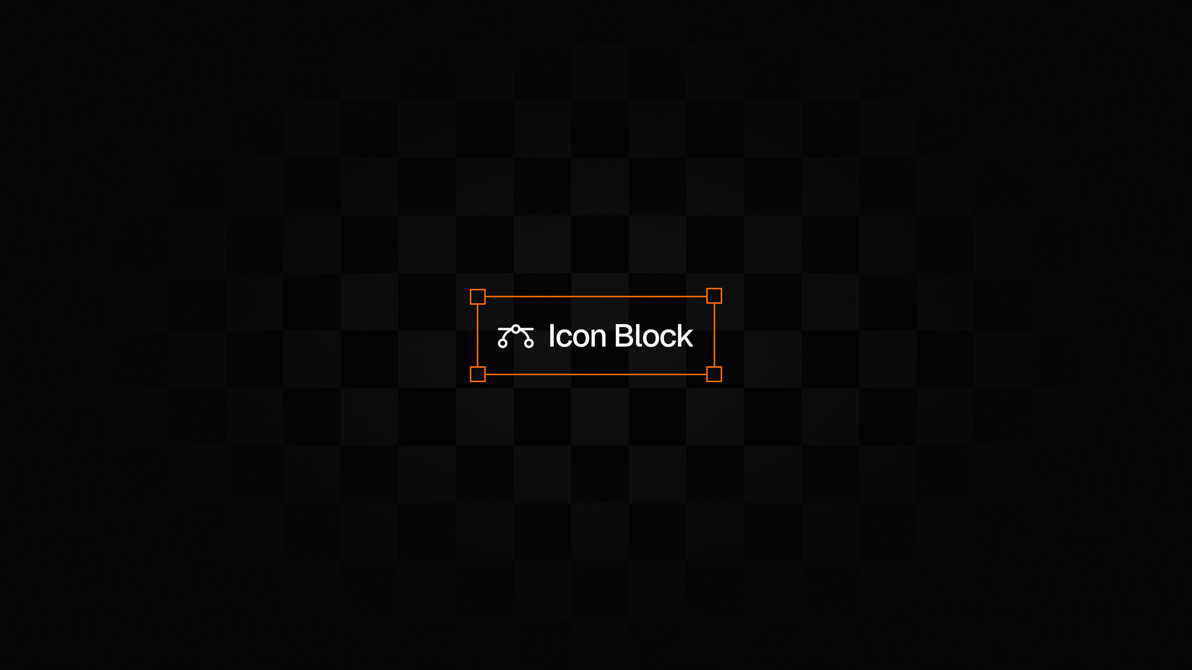
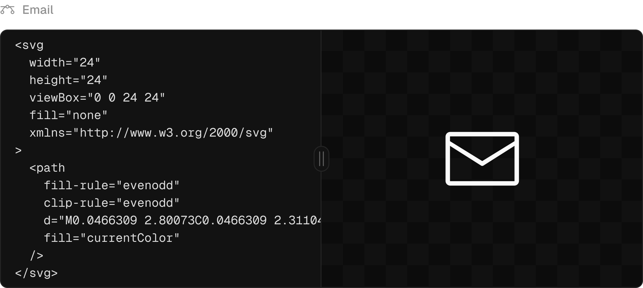
Until now, the only method to host icons or logos in BaseHub has been through image blocks and <img /> elements in your application. This approach presents several limitations:
The inability to customize icon colors makes the solution impractical for scenarios requiring dynamic color schemes, such as dark/light theme switching.
SVG animations cannot be implemented due to the absence of rendered paths, rects, and other vector elements.
The editing workflow in the BaseHub dashboard is awkward, requiring multiple steps (downloading SVGs, optimizing them, and uploading them to BaseHub).
Preview functionality is limited, particularly when detailed inspection through zooming is needed.
The new icon block simplifies the process of working with vectors in BaseHub. It enables seamless rendering of SVG elements in the DOM, offering a more efficient approach compared to traditional image blocks and <img> tags.
Implement this feature using the new Icon component from our SDK.
pnpm add basehub@latestHere's an example demonstrating how to render this block in your React application:
import { Icon } from 'basehub/react-svg'
import { Pump } from 'basehub/react-pump'

export const SocialLinks = () => {
  return (
    <Pump
      queries={[
        {
          links: {
            items: {
              _id: true,
              icon: true,
              label: true,
              href: true,
            },
          },
        },
      ]}
    >
      {async ([{ links }]) => {
        'use server'

        return links.items.map((socialLink) => {
          return (
            <a key={socialLink._id} href={socialLink.href} target="_blank" rel="noopener noreferer">
              <Icon
                content={socialLink.icon}
                components={{
                  svg: (props) => (
                    <svg
                      {...props}
                      style={{
                        color: '#000',
                        width: 32,
                        height: 32,
                        marginLeft: 8,
                      }}
                    />
                  ),
                }}
              />
            </a>
          )
        })
      }}
    </Pump>
  )
}
The components prop enables customization of rendered elements within an SVG. This feature is particularly useful for implementing dynamic styling or animating inner paths, for example.